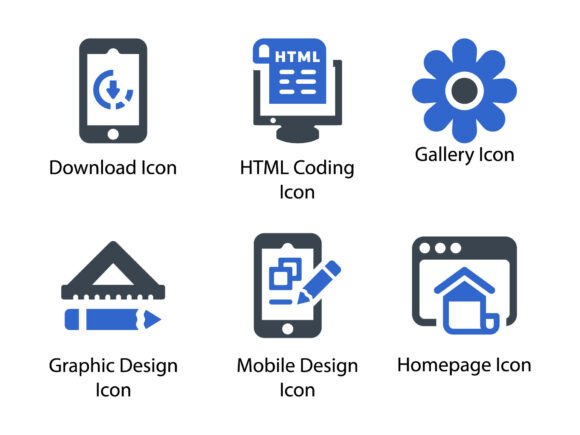
Web Development Icon Set 2
If you're building a website, crafting a pitch deck, designing a mobile app interface, or preparing educational materials, icons aren’t just decorative—they’re functional shorthand. Web Development Icon Set 2 delivers precisely that: a cohesive, thoughtfully crafted collection of glyph icons built for clarity, consistency, and real-world versatility.
More Than Just Pixels—A Thoughtfully Engineered Toolkit
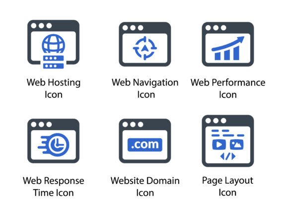
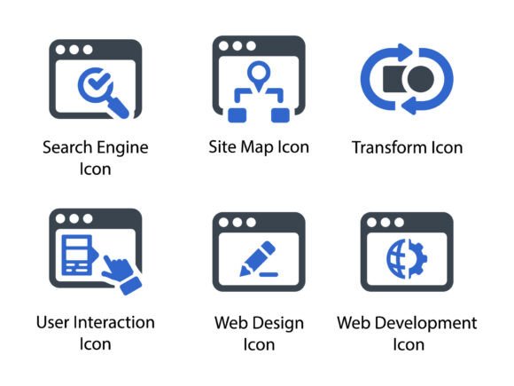
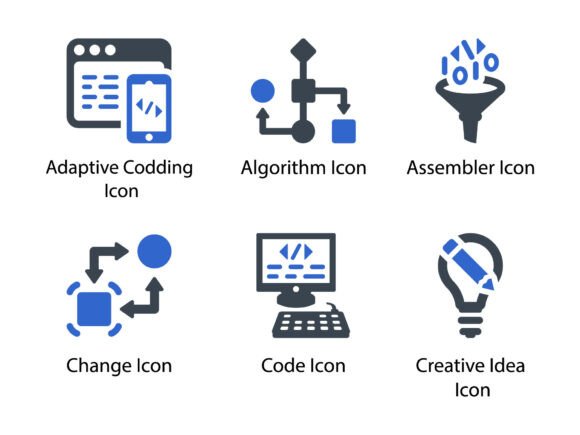
This isn’t a grab-bag of generic symbols. Every icon in Web Development Icon Set 2 was designed with intention—clean lines, balanced negative space, and subtle visual hierarchy ensure legibility at any size. The set includes over 120 meticulously drawn glyphs covering core web development concepts: APIs, databases, responsive layouts, authentication flows, deployment pipelines, accessibility features, and modern frameworks like React, Vue, and Node.js—without leaning on brand-specific logos.
What sets it apart is its technical readiness. Each icon ships in three essential formats: SVG (scalable, code-friendly, perfect for inline use or CSS manipulation), PNG (crisp raster versions at multiple resolutions—including retina-ready 2x and 3x exports), and EPS (for print workflows, vector editing, or legacy design tools). That means whether you're embedding an icon directly into HTML with inline SVG or placing one in a printed investor brochure, the fidelity stays intact.
Where These Icons Actually Shine
You’ll find immediate value across contexts where precision and professionalism matter:
- Homepage & UI Design: Use the “server”, “cloud sync”, or “code editor” icons to visually reinforce trust and technical capability—especially effective above the fold or in feature sections.
- Presentation Slides: Replace bullet points with intuitive glyphs during technical talks or client demos. A well-placed “responsive grid” icon communicates adaptability faster than a sentence.
- Educational Resources: In coding bootcamp handouts or developer documentation, icons act as visual anchors—helping learners quickly scan and retain concepts like “authentication flow” or “CI/CD pipeline”.
- Marketing & Promotional Materials: SaaS landing pages, service cards, or email campaigns benefit from consistent iconography. Pair “API integration” with a brief value statement—it builds credibility without clutter.
- Printed Assets: Business cards, workshop workbooks, or conference swag rely on vector precision. EPS and high-res PNGs mean no pixelation—even when scaled to poster size.
Real-World Efficiency Gains
Time saved adds up fast. Instead of hunting across three stock sites, adjusting stroke weights, converting formats, or redrawing mismatched icons, Web Development Icon Set 2 gives you a unified system—ready to drop in. Developers can copy-paste SVG paths directly into components; designers can drag-and-drop into Figma or Adobe XD with consistent spacing and alignment baked in.
It also supports better communication. When your team uses the same icon language—say, a specific “database” glyph across docs, dashboards, and training videos—it reduces cognitive load and strengthens shared understanding. That’s especially valuable in cross-functional settings: product managers, frontend devs, UX writers, and QA testers all interpret the same visual cues the same way.
Branding With Subtlety, Not Noise
These icons don’t scream. They support. Their neutral, minimalist aesthetic integrates cleanly into established brand systems—no forced color overrides or awkward stylistic clashes. You can recolor them via CSS, apply subtle shadows or transitions, or layer them with typography without compromising readability. That flexibility makes them ideal for white-label platforms, agency templates, or internal toolkits where visual consistency must coexist with brand agility.
Practical Tips Before You Implement
Start by auditing your current icon usage. Are you mixing styles? Relying too heavily on emoji or inconsistent third-party assets? If so, Web Development Icon Set 2 offers a clean reset—not as a full overhaul, but as a strategic upgrade path.
When integrating:
- Test at scale: Drop icons into actual UI contexts—at 16px (for table rows), 32px (navigation), and 96px (hero sections). Verify contrast, spacing, and visual weight hold up.
- Leverage SVG wisely: Use inline SVG for interactive elements (hover states, animations) and external SVG files for static assets. Avoid base64 encoding unless necessary—it bloats HTML.
- Respect accessibility: Always include
aria-labelortitleattributes for functional icons. Decorative ones should havearia-hidden="true". - Stay modular: Don’t force-fit every icon into every project. Pick the 20–30 most relevant to your domain first—then expand as needed.
Also consider context sensitivity. An icon that works perfectly in a developer dashboard (“git commit”, “debug mode”) may need explanation—or even replacement—in a customer-facing help center. Clarity trumps cleverness every time.
Who Benefits Most—and Why
Freelancers building client websites appreciate the time savings and polished output. Educators creating course modules find the visual scaffolding improves student comprehension. Marketing teams launching dev-focused campaigns use the icons to signal technical depth without jargon. Even non-technical founders evaluating web agencies notice the difference in presentation polish—subtle, but meaningful.
And because the set avoids trend-driven quirks (no exaggerated gradients, no forced 3D effects), it ages gracefully. You won’t need to replace these icons every 18 months to stay “current.” They’re built for longevity—not just today’s design system, but next year’s redesign and the one after that.
A Final Note on Intentional Design
Great iconography doesn’t draw attention to itself. It disappears into the experience—making navigation easier, explanations clearer, and interfaces more humane. Web Development Icon Set 2 succeeds because it respects that principle: no wasted detail, no visual noise, no compromise on utility. Whether you’re sketching wireframes at 7 a.m. or finalizing a production build at midnight, it’s the quiet, reliable tool you reach for—not because it’s flashy, but because it simply works.