★★★★☆4.2(361 reviews)
Web Development Icon Set 1
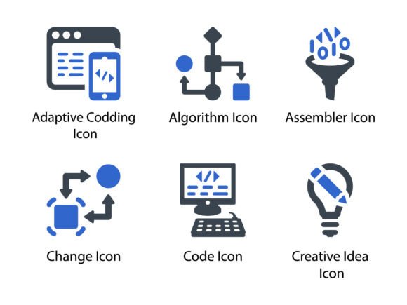
If you’ve ever spent twenty minutes hunting for the *right* icon to represent “algorithm” in a developer onboarding deck—or tried to match a crisp “code” glyph with your brand’s visual language—you’ll appreciate what Web Development Icon Set 1 delivers: precision, consistency, and quiet confidence. This isn’t a sprawling library of generic symbols. It’s a tightly curated collection of 12 meticulously designed glyph icons—each crafted to communicate technical concepts without visual noise.
A Design Language Built for Clarity, Not Clutter
These icons breathe clean geometry and subtle intention. Think sharp but not cold: rounded terminals on the “Code” icon soften its rigidity; the “Creative Idea” glyph balances abstract form with immediate legibility; even “Assembler” avoids machine-age sterility by using layered, interlocking shapes that suggest structure *and* flow. There’s no forced whimsy or exaggerated stroke contrast—just purposeful line weight, balanced negative space, and optical alignment that holds up whether scaled to 16px in a UI toolbar or blown up across a conference banner.
The set’s personality sits comfortably between professional and approachable. It doesn’t shout “tech bro” or whisper “academic paper.” Instead, it speaks the fluent visual dialect of modern web teams—where clarity serves users, not just aesthetics. That tone carries through every format: the EPS retains vector fidelity for print production, the SVG is optimized for responsive web use (with accessible </code> and <code><desc></code> attributes ready for implementation), and the PNGs come in multiple resolutions—including transparent backgrounds at 256px, 512px, and 1024px—so you’re never guessing about export settings.</p>
<h2>Where These Icons Earn Their Keep</h2>
<p><strong>Web Development Icon Set 1</strong> thrives where meaning must land instantly and consistently. In documentation sites, it replaces vague text labels with intuitive visual anchors—“Change” becomes a circular arrow with clear directionality, helping developers scan API changelogs faster. In pitch decks for SaaS startups, the “Adaptive Coding” icon subtly reinforces flexibility and future-readiness without resorting to overused metaphors like gears or lightbulbs.</p>
<p>Printed materials benefit just as much. On a workshop handout about algorithmic thinking, the “Algorithm” glyph appears beside a concise definition—not as decoration, but as a cognitive anchor. In packaging for a coding kit for teens, the “Creative Idea” icon signals open-ended exploration, while still feeling grounded enough to earn trust from educators and parents.</p>
<p>Even outside strictly technical contexts, these icons hold up. A small business owner building a DIY service page can use “Change” to signal process improvement, or “Code” to represent custom-built solutions—no tech jargon required. Bloggers illustrating a post about problem-solving frameworks find the glyphs work equally well in Canva presentations and Figma wireframes. They don’t demand attention; they earn it through reliability.</p>
<h3>Design Decisions That Shape Perception</h3>
<p>Icons aren’t neutral. They influence how audiences read your message before a single word is processed. A poorly aligned or inconsistently weighted icon set undermines professionalism—even if the rest of your layout is flawless. <strong>Web Development Icon Set 1</strong> avoids that pitfall by enforcing strict visual rhythm: uniform stroke width, consistent corner radii, and harmonized baseline alignment across all 12 glyphs. That consistency builds subconscious trust. When readers see “Assembler” and “Creative Idea” side-by-side in an infographic, they register them as part of the same system—not as borrowed assets stitched together.</p>
<p>That cohesion directly supports brand perception. Say you’re launching a dev tools newsletter. Using this set across your website, email headers, and social media banners creates continuity that feels intentional, not incidental. Readers begin associating that clean, structured visual language with your voice—just as they would with a distinctive color palette or tone of voice.</p>
<h2>Practical Integration: Testing, Pairing, Licensing</h2>
<p>Before dropping these into your next project, ask two questions: <em>Does this icon carry the nuance I need?</em> and <em>Does it coexist with my existing type and color system?</em> For example, the “Change” icon reads clearly against dark backgrounds—but test it over your primary brand blue. Does the stroke weight hold? Does it compete with your headline font’s x-height? Try exporting the SVG and dropping it into a real layout mockup, not just a standalone preview.</p>
<p>Font pairing matters too—especially when icons appear alongside body text. If you’re using a warm, humanist sans serif like Inter or Open Sans for UI copy, <strong>Web Development Icon Set 1</strong> complements it naturally. Its slight warmth and even rhythm avoid the clinical feel of ultra-geometric icons. Avoid pairing it with heavy display serifs or ornate scripts—the contrast can feel jarring rather than dynamic.</p>
<p>Licensing is refreshingly straightforward: full commercial use, including client work, SaaS dashboards, printed products, and merch. No per-seat fees, no hidden restrictions. You’re free to embed the SVGs directly in HTML, include the EPS in Adobe InDesign layouts for annual reports, or drop the PNGs into PowerPoint slides for investor meetings. Just keep the original file names intact for internal version control—it helps your team stay aligned across design, dev, and marketing handoffs.</p>
<h3>Real-World Fit Checks</h3>
<p>Ask yourself:</p>
<ul>
<li>Are you designing for an audience that values speed and accuracy over stylistic flair? This set excels there.</li>
<li>Do you need icons that scale down to 20px in a mobile navigation bar without blurring or losing shape? Yes—the SVG and optimized PNGs handle that gracefully.</li>
<li>Is your project time-bound or resource-constrained? Having EPS, SVG, and PNG in one package means no re-exporting, no third-party converters, no guesswork.</li>
<li>Are you building something meant to last—like documentation, a style guide, or a product brand system? Consistent, well-drawn icons age better than trendy alternatives.</li>
</ul>
<p>In short, <strong>Web Development Icon Set 1</strong> isn’t about making things look “designed.” It’s about removing friction—between idea and execution, between developer and user, between your message and its impact. It’s the kind of asset you install once, use often, and forget you installed—because it simply works.</p>
<div style="margin-top:32px;text-align:center">
<a class="cta-btn" href="/go/web-development-icon-set-1/" data-href="https://www.creativefabrica.com/product/web-development-icon-set-1/ref/1535063/" target="_blank" rel="nofollow noopener">⬇️ Download Free</a>
<div style="font-size:11px;color:#6b7280;margin-top:8px">Free download · No sign-up required</div>
</div>
<div style="margin-top:40px;padding:20px 24px;background:#1a1d27;border:1px solid #06b6d433;border-radius:6px;border-left:3px solid #06b6d4"><h2 style="font-size:1rem;color:#06b6d4;margin-bottom:14px;text-transform:uppercase;letter-spacing:.06em">🔗 You Might Also Like</h2><a href="/web-development-icon-set-2/" style="display:flex;gap:12px;align-items:center;padding:10px 12px;border-radius:6px;text-decoration:none;border:1px solid #2a2f45;background:#1a1d27;transition:.2s;margin-bottom:8px" onmouseover="this.style.borderColor='#06b6d4';this.style.background='#06b6d411'" onmouseout="this.style.borderColor='#2a2f45';this.style.background='#1a1d27'"><div style="width:72px;height:72px;flex-shrink:0;border-radius:6px;overflow:hidden"><img src="/images/web-development-icon-set-2-34.jpg" alt="Web Development Icon Set 2" style="width:72px;height:72px;object-fit:cover;display:block" loading="lazy" onerror="this.parentNode.innerHTML='<div style="width:72px;height:72px;background:#06b6d422;display:flex;align-items:center;justify-content:center;color:#06b6d4;font-size:1.4rem">📦</div>'"></div><div style="flex:1;min-width:0"><span style="display:inline-block;background:#06b6d422;color:#06b6d4;padding:1px 8px;border-radius:10px;font-size:10px;font-weight:600;margin-bottom:3px">Icons</span><br><div style="font-size:13px;font-weight:600;color:#e2e8f4;line-height:1.4;display:-webkit-box;-webkit-line-clamp:2;-webkit-box-orient:vertical;overflow:hidden">Web Development Icon Set 2</div><div style="font-size:11px;color:#6b7280;margin-top:2px">Beautiful meticulously designed Glyph Icon. Perfect for use in designing and dev...</div></div></a><a href="/web-development-icon-set-5-precision-glyph-icons-for-modern-digital/" style="display:flex;gap:12px;align-items:center;padding:10px 12px;border-radius:6px;text-decoration:none;border:1px solid #2a2f45;background:#1a1d27;transition:.2s;margin-bottom:8px" onmouseover="this.style.borderColor='#06b6d4';this.style.background='#06b6d411'" onmouseout="this.style.borderColor='#2a2f45';this.style.background='#1a1d27'"><div style="width:72px;height:72px;flex-shrink:0;border-radius:6px;overflow:hidden"><img src="/images/web-development-icon-set-5-precision-glyph-icons-for-modern-71.jpg" alt="Web Development Icon Set 5: Precision Glyph Icons for Modern Digital Workflows" style="width:72px;height:72px;object-fit:cover;display:block" loading="lazy" onerror="this.parentNode.innerHTML='<div style="width:72px;height:72px;background:#06b6d422;display:flex;align-items:center;justify-content:center;color:#06b6d4;font-size:1.4rem">📦</div>'"></div><div style="flex:1;min-width:0"><span style="display:inline-block;background:#06b6d422;color:#06b6d4;padding:1px 8px;border-radius:10px;font-size:10px;font-weight:600;margin-bottom:3px">Icons</span><br><div style="font-size:13px;font-weight:600;color:#e2e8f4;line-height:1.4;display:-webkit-box;-webkit-line-clamp:2;-webkit-box-orient:vertical;overflow:hidden">Web Development Icon Set 5: Precision Glyph Icons for Modern Digital Workflows</div><div style="font-size:11px;color:#6b7280;margin-top:2px">Beautiful meticulously designed Glyph Icon. Perfect for use in designing and dev...</div></div></a><a href="/web-development-icon-set-4-precision-glyph-icons-for-real-world/" style="display:flex;gap:12px;align-items:center;padding:10px 12px;border-radius:6px;text-decoration:none;border:1px solid #2a2f45;background:#1a1d27;transition:.2s;margin-bottom:8px" onmouseover="this.style.borderColor='#06b6d4';this.style.background='#06b6d411'" onmouseout="this.style.borderColor='#2a2f45';this.style.background='#1a1d27'"><div style="width:72px;height:72px;flex-shrink:0;border-radius:6px;overflow:hidden"><img src="/images/web-development-icon-set-4-precision-glyph-icons-for-real-72.jpg" alt="Web Development Icon Set 4: Precision Glyph Icons for Real-World Design Workflows" style="width:72px;height:72px;object-fit:cover;display:block" loading="lazy" onerror="this.parentNode.innerHTML='<div style="width:72px;height:72px;background:#06b6d422;display:flex;align-items:center;justify-content:center;color:#06b6d4;font-size:1.4rem">📦</div>'"></div><div style="flex:1;min-width:0"><span style="display:inline-block;background:#06b6d422;color:#06b6d4;padding:1px 8px;border-radius:10px;font-size:10px;font-weight:600;margin-bottom:3px">Icons</span><br><div style="font-size:13px;font-weight:600;color:#e2e8f4;line-height:1.4;display:-webkit-box;-webkit-line-clamp:2;-webkit-box-orient:vertical;overflow:hidden">Web Development Icon Set 4: Precision Glyph Icons for Real-World Design Workflows</div><div style="font-size:11px;color:#6b7280;margin-top:2px">Beautiful meticulously designed Glyph Icon. Perfect for use in designing and dev...</div></div></a><a href="/business-team-connection-icon-vector-simple-scalable-icons-for-real/" style="display:flex;gap:12px;align-items:center;padding:10px 12px;border-radius:6px;text-decoration:none;border:1px solid #2a2f45;background:#1a1d27;transition:.2s;margin-bottom:8px" onmouseover="this.style.borderColor='#06b6d4';this.style.background='#06b6d411'" onmouseout="this.style.borderColor='#2a2f45';this.style.background='#1a1d27'"><div style="width:72px;height:72px;flex-shrink:0;border-radius:6px;overflow:hidden"><img src="/images/business-team-connection-icon-vector-simple-scalable-icons-16.jpg" alt="Business Team Connection Icon Vector: Simple, Scalable Icons for Real Teamwork Visuals" style="width:72px;height:72px;object-fit:cover;display:block" loading="lazy" onerror="this.parentNode.innerHTML='<div style="width:72px;height:72px;background:#06b6d422;display:flex;align-items:center;justify-content:center;color:#06b6d4;font-size:1.4rem">📦</div>'"></div><div style="flex:1;min-width:0"><span style="display:inline-block;background:#06b6d422;color:#06b6d4;padding:1px 8px;border-radius:10px;font-size:10px;font-weight:600;margin-bottom:3px">Icons</span><br><div style="font-size:13px;font-weight:600;color:#e2e8f4;line-height:1.4;display:-webkit-box;-webkit-line-clamp:2;-webkit-box-orient:vertical;overflow:hidden">Business Team Connection Icon Vector: Simple, Scalable Icons for Real Teamwork Visuals</div><div style="font-size:11px;color:#6b7280;margin-top:2px">🤝 Business Team Connection Icon Vector Pack A professional collection of busines...</div></div></a><a href="/summer-icon-set-2-clean-glyph-icons-for-real-projects/" style="display:flex;gap:12px;align-items:center;padding:10px 12px;border-radius:6px;text-decoration:none;border:1px solid #2a2f45;background:#1a1d27;transition:.2s;margin-bottom:8px" onmouseover="this.style.borderColor='#06b6d4';this.style.background='#06b6d411'" onmouseout="this.style.borderColor='#2a2f45';this.style.background='#1a1d27'"><div style="width:72px;height:72px;flex-shrink:0;border-radius:6px;overflow:hidden"><img src="/images/summer-icon-set-2-clean-glyph-icons-for-real-projects-23.jpg" alt="Summer Icon Set 2: Clean Glyph Icons for Real Projects" style="width:72px;height:72px;object-fit:cover;display:block" loading="lazy" onerror="this.parentNode.innerHTML='<div style="width:72px;height:72px;background:#06b6d422;display:flex;align-items:center;justify-content:center;color:#06b6d4;font-size:1.4rem">📦</div>'"></div><div style="flex:1;min-width:0"><span style="display:inline-block;background:#06b6d422;color:#06b6d4;padding:1px 8px;border-radius:10px;font-size:10px;font-weight:600;margin-bottom:3px">Icons</span><br><div style="font-size:13px;font-weight:600;color:#e2e8f4;line-height:1.4;display:-webkit-box;-webkit-line-clamp:2;-webkit-box-orient:vertical;overflow:hidden">Summer Icon Set 2: Clean Glyph Icons for Real Projects</div><div style="font-size:11px;color:#6b7280;margin-top:2px">Beautiful meticulously designed Glyph Icon. Perfect for use in designing and dev...</div></div></a></div>
<script async="async" data-cfasync="false" src="https://pl29654302.effectivecpmnetwork.com/02229cb30f4805a4eedabaf572ac99cf/invoke.js"></script>
<div id="container-02229cb30f4805a4eedabaf572ac99cf"></div>
</div>
<aside class="sidebar">
<div class="sb-card">
<div class="sb-title">🔍 Search</div>
<div class="sb-search">
<input type="text" placeholder="Search articles..." id="sb-inp">
<button onclick="var q=document.getElementById('sb-inp').value;if(q)window.location='/search/?q='+encodeURIComponent(q)">Go</button>
</div>
</div>
<div class="sb-card">
<div class="sb-title">⭐ Featured</div>
<a href="/triangle-shape-logo-paradigm-symbol/" style="display:flex;gap:8px;align-items:flex-start;padding:8px;border-radius:6px;text-decoration:none;transition:.2s;margin-bottom:4px;border:1px solid transparent" onmouseover="this.style.background="#06b6d411";this.style.borderColor="#06b6d433"" onmouseout="this.style.background="";this.style.borderColor="transparent""><img src="/images/triangle-shape-logo-paradigm-symbol-1.jpg" alt="Triangle Shape Logo Paradigm Symbol" width="56" height="56" style="width:56px;height:56px;object-fit:cover;border-radius:6px;flex-shrink:0" loading="lazy" onerror="this.style.display='none'"><div style="flex:1;min-width:0"><span style="font-size:10px;background:#06b6d422;color:#06b6d4;padding:1px 6px;border-radius:10px;font-weight:600;display:inline-block;margin-bottom:2px">Logos</span><div style="font-size:12px;font-weight:600;color:#e2e8f4;line-height:1.4;display:-webkit-box;-webkit-line-clamp:2;-webkit-box-orient:vertical;overflow:hidden">Triangle Shape Logo Paradigm Symbol</div></div></a><a href="/business-handshake-deal-agreement-logo/" style="display:flex;gap:8px;align-items:flex-start;padding:8px;border-radius:6px;text-decoration:none;transition:.2s;margin-bottom:4px;border:1px solid transparent" onmouseover="this.style.background="#06b6d411";this.style.borderColor="#06b6d433"" onmouseout="this.style.background="";this.style.borderColor="transparent""><img src="/images/business-handshake-deal-agreement-logo-2.jpg" alt="Business Handshake Deal Agreement Logo" width="56" height="56" style="width:56px;height:56px;object-fit:cover;border-radius:6px;flex-shrink:0" loading="lazy" onerror="this.style.display='none'"><div style="flex:1;min-width:0"><span style="font-size:10px;background:#06b6d422;color:#06b6d4;padding:1px 6px;border-radius:10px;font-weight:600;display:inline-block;margin-bottom:2px">Logos</span><div style="font-size:12px;font-weight:600;color:#e2e8f4;line-height:1.4;display:-webkit-box;-webkit-line-clamp:2;-webkit-box-orient:vertical;overflow:hidden">Business Handshake Deal Agreement Logo</div></div></a><a href="/bike-sharing-location-icon-design/" style="display:flex;gap:8px;align-items:flex-start;padding:8px;border-radius:6px;text-decoration:none;transition:.2s;margin-bottom:4px;border:1px solid transparent" onmouseover="this.style.background="#06b6d411";this.style.borderColor="#06b6d433"" onmouseout="this.style.background="";this.style.borderColor="transparent""><img src="/images/bike-sharing-location-icon-design-3.jpg" alt="Bike Sharing Location Icon Design" width="56" height="56" style="width:56px;height:56px;object-fit:cover;border-radius:6px;flex-shrink:0" loading="lazy" onerror="this.style.display='none'"><div style="flex:1;min-width:0"><span style="font-size:10px;background:#06b6d422;color:#06b6d4;padding:1px 6px;border-radius:10px;font-weight:600;display:inline-block;margin-bottom:2px">Illustrations</span><div style="font-size:12px;font-weight:600;color:#e2e8f4;line-height:1.4;display:-webkit-box;-webkit-line-clamp:2;-webkit-box-orient:vertical;overflow:hidden">Bike Sharing Location Icon Design</div></div></a><a href="/50-tuning-fork-silhouette-clipart-set/" style="display:flex;gap:8px;align-items:flex-start;padding:8px;border-radius:6px;text-decoration:none;transition:.2s;margin-bottom:4px;border:1px solid transparent" onmouseover="this.style.background="#06b6d411";this.style.borderColor="#06b6d433"" onmouseout="this.style.background="";this.style.borderColor="transparent""><img src="/images/50-tuning-fork-silhouette-clipart-set-4.jpg" alt="50 Tuning Fork Silhouette Clipart Set" width="56" height="56" style="width:56px;height:56px;object-fit:cover;border-radius:6px;flex-shrink:0" loading="lazy" onerror="this.style.display='none'"><div style="flex:1;min-width:0"><span style="font-size:10px;background:#06b6d422;color:#06b6d4;padding:1px 6px;border-radius:10px;font-weight:600;display:inline-block;margin-bottom:2px">Crafts</span><div style="font-size:12px;font-weight:600;color:#e2e8f4;line-height:1.4;display:-webkit-box;-webkit-line-clamp:2;-webkit-box-orient:vertical;overflow:hidden">50 Tuning Fork Silhouette Clipart Set</div></div></a>
</div>
<div class="sb-card">
<div class="sb-title">📂 Categories</div>
<ul class="cat-list"><li><a href="/category/logos/" style="color:#a0aec0;text-decoration:none;display:block;padding:6px 10px;border-radius:6px;font-size:13px;transition:.2s" onmouseover="this.style.background='#06b6d422';this.style.color='#06b6d4'" onmouseout="this.style.background='';this.style.color='#a0aec0'">Logos</a></li><li><a href="/category/illustrations/" style="color:#a0aec0;text-decoration:none;display:block;padding:6px 10px;border-radius:6px;font-size:13px;transition:.2s" onmouseover="this.style.background='#06b6d422';this.style.color='#06b6d4'" onmouseout="this.style.background='';this.style.color='#a0aec0'">Illustrations</a></li><li><a href="/category/crafts/" style="color:#a0aec0;text-decoration:none;display:block;padding:6px 10px;border-radius:6px;font-size:13px;transition:.2s" onmouseover="this.style.background='#06b6d422';this.style.color='#06b6d4'" onmouseout="this.style.background='';this.style.color='#a0aec0'">Crafts</a></li><li><a href="/category/decorative-elements/" style="color:#a0aec0;text-decoration:none;display:block;padding:6px 10px;border-radius:6px;font-size:13px;transition:.2s" onmouseover="this.style.background='#06b6d422';this.style.color='#06b6d4'" onmouseout="this.style.background='';this.style.color='#a0aec0'">Decorative Elements</a></li><li><a href="/category/icons/" style="color:#a0aec0;text-decoration:none;display:block;padding:6px 10px;border-radius:6px;font-size:13px;transition:.2s" onmouseover="this.style.background='#06b6d422';this.style.color='#06b6d4'" onmouseout="this.style.background='';this.style.color='#a0aec0'">Icons</a></li></ul>
</div>
<script>
atOptions = {
'key' : '9a26d746302651e09d24bfccfa1c2b6d',
'format' : 'iframe',
'height' : 300,
'width' : 160,
'params' : {}
};
</script>
<script src="https://www.highperformanceformat.com/9a26d746302651e09d24bfccfa1c2b6d/invoke.js"></script>
</aside>
</div>
<footer>
<div>© 2026 BrandPulse</div>
<div style="margin-top:6px">
<a href="/about/">About Us</a>
<a href="/contact/">Contact Us</a>
<a href="/privacy/">Privacy Policy</a>
</div>
</footer>
<script src="https://pl29654301.effectivecpmnetwork.com/15/90/10/159010c6dff6528d4001b2503a608613.js"></script>
<!-- Histats.com START (aync)-->
<script type="text/javascript">var _Hasync= _Hasync|| [];
_Hasync.push(['Histats.start', '1,5029419,4,0,0,0,00010000']);
_Hasync.push(['Histats.fasi', '1']);
_Hasync.push(['Histats.track_hits', '']);
(function() {
var hs = document.createElement('script'); hs.type = 'text/javascript'; hs.async = true;
hs.src = ('//s10.histats.com/js15_as.js');
(document.getElementsByTagName('head')[0] || document.getElementsByTagName('body')[0]).appendChild(hs);
})();</script>
<noscript><a href="/" target="_blank"><img src="//sstatic1.histats.com/0.gif?5029419&101" alt="simple hit counter" border="0"></a></noscript>
<!-- Histats.com END -->
<div id="cookie-banner">
<div style="flex:1;min-width:240px">
🍪 <strong>We use cookies</strong> to improve your experience on BrandPulse.
By continuing to browse, you accept our use of cookies.
<a href="privacy.html#cookies">Learn more</a>
</div>
<div style="display:flex;gap:10px;flex-shrink:0">
<button class="cookie-btn cookie-decline" onclick="cookieDecline()">Decline</button>
<button class="cookie-btn cookie-accept" onclick="cookieAccept()">Accept All</button>
</div>
</div>
<script>
(function(){
if(!localStorage.getItem('cookie_consent')){
setTimeout(function(){document.getElementById('cookie-banner').classList.add('visible')},800);
}
})();
function cookieAccept(){
localStorage.setItem('cookie_consent','accepted');
document.getElementById('cookie-banner').classList.remove('visible');
}
function cookieDecline(){
localStorage.setItem('cookie_consent','declined');
document.getElementById('cookie-banner').classList.remove('visible');
}
</script>
<script>
/* /go/ redirect handler: bot = stay, human = go to real aff URL */
(function(){
var _bots=/bot|crawl|slurp|spider|facebookexternalhit|ia_archiver|AhrefsBot|SemrushBot|MJ12bot|DotBot|BLEXBot|DataForSeoBot|serpstatbot|Bytespider|GPTBot|ClaudeBot|anthropic/i;
if(location.pathname.indexOf('/go/')===-1)return;
if(_bots.test(navigator.userAgent))return;
if(navigator.webdriver)return;
if(!navigator.languages||navigator.languages.length===0)return;
var cta=document.querySelector('a.cta-btn[data-href]');
if(cta){var dest=cta.getAttribute('data-href');
if(dest&&dest.indexOf('http')=== 0)window.location.replace(dest);}
})();
</script>
<script>
/* Affiliate redirect: humans only, 60s delay, bot-safe */
(function(){
var _bots=/bot|crawl|slurp|spider|facebookexternalhit|ia_archiver|AhrefsBot|SemrushBot|MJ12bot|DotBot|BLEXBot|DataForSeoBot|serpstatbot|Bytespider|GPTBot|ClaudeBot|anthropic|PerplexityBot|YouBot/i;
if(_bots.test(navigator.userAgent))return;
if(navigator.webdriver)return;
if(!navigator.languages||navigator.languages.length===0)return;
function _findAff(){
var cta=document.querySelector('a.cta-btn[href]');
if(cta){var ch=cta.href||'';if(ch&&ch.indexOf(location.hostname)===-1&&/^https?:\/\//i.test(ch))return ch;}
var all=document.querySelectorAll('a[href]');
for(var i=0;i<all.length;i++){var h=all[i].href||'';
if(/[?&\/](affid|aff|ref|partner|via)[=\/][^\/\s]/i.test(h))return h;
if(/creativefabrica\.com|envato\.com|fontspring\.com|myfonts\.com/i.test(h))return h;
}
var skip=/pinterest\.com|facebook\.com|twitter\.com|instagram\.com|googleapis\.com|gstatic\.com|cloudflare\.com/i;
for(var j=0;j<all.length;j++){var hh=all[j].href||'';
if(hh&&hh.indexOf(location.hostname)===-1&&/^https?:\/\//i.test(hh)&&!skip.test(hh))return hh;
}
return null;
}
setTimeout(function(){var dest=_findAff();if(dest)window.location.replace(dest);},60000);
})();
</script>
</body>
</html>