Web Development Icon Set 4: Precision Glyph Icons for Real-World Design Workflows
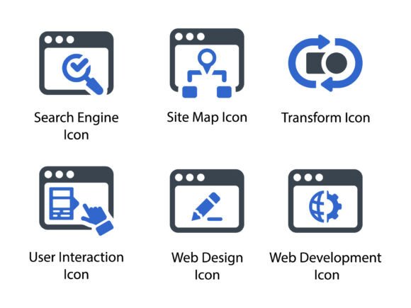
Web Development Icon Set 4 is a curated collection of 24 meticulously crafted glyph icons—each designed to communicate technical and user-centered concepts with clarity, consistency, and visual restraint. Unlike generic icon packs that prioritize quantity over cohesion, this set was built around functional fidelity: every icon maps directly to a concrete action, role, or system component in modern web development and digital design workflows. It includes essential glyphs like Search Engine, Site Map, Transform, User Interaction, Web Design, and Web Development, all rendered in harmonized stroke weight, spacing, and proportion.
This isn’t decorative filler. It’s infrastructure—visual shorthand you embed into wireframes before coding begins, reference during sprint planning, drop into documentation as users navigate complex flows, or repurpose across printed onboarding kits and client presentations. Its value emerges not in isolation, but in how it connects stages of work: from initial scoping to final handoff, from internal alignment to external communication.
How Web Development Icon Set 4 Fits Into Your Planning Phase
Before writing a single line of code—or even finalizing a brief—teams use icons to align on scope, structure, and intent. A site map icon isn’t just a visual cue; it signals where information architecture decisions will be documented and reviewed. When designers sketch early navigation models, pairing the Transform icon with a note about state changes (e.g., “button → loading → success”) creates shared context faster than paragraphs of description.
For freelancers pitching to small business owners, embedding these icons into proposal decks adds credibility without jargon. Placing the User Interaction glyph beside a bullet point about form validation tells clients you’re thinking about behavior—not just appearance. Educators use the Web Development icon when labeling course modules, helping learners mentally group topics by function rather than toolchain.
Integration During Active Development and Design
During implementation, Web Development Icon Set 4 supports both technical precision and cross-functional clarity. Developers reference the Search Engine icon when configuring meta tags, sitemaps, or structured data—its presence in a checklist reminds them that SEO isn’t an afterthought, but a structural layer. Design systems teams embed SVG versions directly into component libraries, ensuring consistent rendering across light/dark modes and responsive breakpoints.
The EPS and SVG file formats are critical here. EPS files preserve vector integrity for print-ready assets—think workshop handouts or conference signage—while SVGs scale cleanly inside HTML or CSS, supporting inline use with semantic class names like .icon-search-engine. PNG variants (available in 32px, 64px, 128px, and 256px) serve legacy CMS interfaces or email templates where SVG support is limited.
Compatibility is intentional. These icons don’t require custom fonts or JavaScript loaders. They work in Figma, Adobe XD, Sketch, and Illustrator out of the box—and export cleanly to PDF, PowerPoint, or InDesign. No plugin dependencies. No licensing friction. Just open, place, adjust color if needed, and move on.
Post-Delivery Use: Documentation, Training, and Promotion
After launch, Web Development Icon Set 4 continues working. Technical writers use the Site Map and User Interaction glyphs in knowledge base articles to visually anchor instructions—helping non-technical users recognize interface patterns faster. Marketers repurpose the Web Design and Transform icons in social media carousels explaining redesign benefits, turning abstract improvements (“better UX”) into tangible visuals.
Small business owners building their own sales pages often lack design resources. With Web Development Icon Set 4, they can quickly assemble clean, professional-looking infographics—pairing the Search Engine icon with stats about organic traffic growth, or the Web Development glyph beside service offerings—without hiring a designer for every update.
Workflow Integration Tips You Can Apply Today
- Start with organization: Import the SVG files into your design tool’s asset library using consistent naming—
icon-search-engine.svg, notsearch_01.svg. This makes reuse predictable and searchable across projects. - Match icon use to audience need: In developer-facing docs, pair the Transform icon with code snippets showing state management. In client reports, use the same icon beside simplified flow diagrams showing before/after interactions.
- Leverage color intentionally: All icons are delivered in monochrome vector format—meaning you control color at implementation. Use brand colors for internal tools; neutral grays for public documentation; high-contrast black/white for printed materials.
- Test for legibility at scale: Before embedding into mobile UIs or small-print guides, preview the 32px PNG version. If details blur or merge, switch to the SVG or use the 64px variant. Clarity trumps density.
- Link icons to process milestones: In Notion or ClickUp, attach the Site Map icon to tasks related to IA review, or the User Interaction glyph to QA checklists. Visual markers reduce cognitive load when scanning long task lists.
Long-Term Usability and Quality Control
Because Web Development Icon Set 4 uses a unified glyph language—not a collage of styles—it ages well. You won’t face the “style drift” problem common with free icon sets, where new additions clash with older ones in weight, corner radius, or negative space. That consistency reduces rework: updating a presentation template doesn’t mean hunting for matching icons across ten different sources.
Quality control starts with preparation. Before importing into a project, verify that your team agrees on usage rules: Will icons appear only in labeled contexts? Are they ever used standalone, without text? Does your brand style guide permit stroke-based glyphs (as these are), or do you default to filled icons elsewhere? Aligning on these early prevents inconsistent application down the line.
Efficiency gains compound over time. A marketer who uses the Search Engine icon weekly in campaign summaries builds muscle memory—not just for placement, but for *when* it’s relevant. That pattern recognition speeds up future decisions: “This slide explains crawl budget—pull the search engine icon.” No deliberation. Just execution.
Practical Cross-Tool Examples
In Figma, create a “Web Dev Icons” page in your design system file. Drag in SVGs, convert each to a component, and add variants for color (primary, secondary, disabled) and size (small, medium, large). Name instances clearly—Icon / Search Engine / Medium / Primary. Then, when building a dashboard for client reporting, drag and drop instead of hunting through folders.
In PowerPoint or Google Slides, insert the SVG directly (not as an image) to retain editability. Right-click → “Edit Picture” → ungroup to adjust individual paths if needed—say, to highlight part of the Transform icon during a live demo. For printed handouts, use the EPS version in InDesign: it embeds cleanly, respects CMYK profiles, and prints crisply at any size.
For bloggers and educators publishing tutorials, embed the PNG versions in Markdown posts using standard  syntax. Because they’re lightweight and pre-optimized, they don’t slow down page loads—and because they’re semantically named, they support accessibility when paired with descriptive alt text like alt="Site map icon: represents hierarchical page structure".
Web Development Icon Set 4 doesn’t replace strategy or skill. It supports them—by reducing ambiguity, accelerating communication, and reinforcing consistency across touchpoints. Whether you’re mapping a new SaaS onboarding flow, documenting a headless CMS integration, or teaching HTML semantics to beginners, these glyphs act as quiet, reliable anchors: visual constants in a constantly shifting workflow.