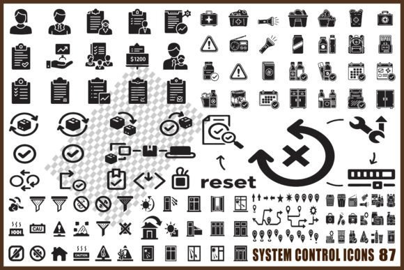
System Control Icon Pack: 87 Clean Black Vector Icons
If you’ve ever spent 20 minutes searching for a single, consistent icon to represent “system alert,” “workflow step,” or “process validation” — only to settle for something mismatched, low-res, or overdesigned — the System Control Icon Pack solves that quietly and effectively. It’s not flashy. It doesn’t promise to transform your workflow overnight. But it does deliver 87 purpose-built black vector icons, each crafted with precision for clarity, consistency, and real-world utility.
Why Minimal Black Silhouettes Work Where Others Fall Short
Many icon sets prioritize visual flair over function — gradients, shadows, or exaggerated outlines that break down at small sizes or clash in technical interfaces. The System Control Icon Pack opts for a minimal solid silhouette style: clean edges, unambiguous shapes, and intentional negative space. This isn’t just aesthetic restraint — it’s functional discipline. A “settings gear” icon remains legible at 16px in a dashboard sidebar. A “checklist item” holds up in a printed process manual. And because all icons share the same weight, scale, and visual rhythm, they integrate seamlessly without manual tweaking.
This consistency saves time across roles. A UX designer building a new admin panel can drop icons directly into Figma or Sketch without adjusting stroke widths or alignment. An educator creating a systems-thinking handout avoids hunting through five different sources for matching “alert,” “pause,” and “restart” symbols. Even a small business owner updating their internal SOPs gains credibility — not from complexity, but from visual coherence.
Practical Use Cases Across Real Projects
The value of the System Control Icon Pack reveals itself most clearly in context. Here’s how it supports specific, everyday needs:
- Dashboard interfaces: Need to distinguish between “live status,” “pending action,” and “error threshold”? All three are included — as scalable SVGs that render crisply on Retina displays and export cleanly to PDF reports.
- Workflow diagrams: Whether mapping IT incident response or onboarding steps, icons like “manual intervention,” “automated trigger,” and “approval gate” clarify sequence and responsibility without text overload.
- Technical documentation: Engineers and support teams benefit from unambiguous symbols for “configuration,” “rollback,” “audit log,” and “system health.” No guessing whether a “warning” icon signals severity level one or four.
- Infographics for non-technical audiences: A marketer explaining cloud infrastructure or data flow can use “server cluster,” “data sync,” and “firewall” icons to ground abstract concepts — without relying on clipart or inconsistent stock assets.
What makes this especially useful is its scope: 87 icons cover system actions (e.g., “reboot,” “suspend”), controls (e.g., “toggle,” “slider”), alerts (e.g., “critical error,” “low priority”), checklists (e.g., “completed,” “in progress”), settings (e.g., “preferences,” “access control”), and process management (e.g., “branch point,” “merge,” “validation”). That breadth means fewer gaps — and less time stitching together mismatched resources.
File Formats That Match How You Actually Work
Having the right format matters more than having “many” formats. The System Control Icon Pack includes exactly what professionals need — no bloat, no redundancy:
- SVG: Ideal for web apps, responsive dashboards, and modern UI tools. Scales infinitely without quality loss and integrates natively into HTML/CSS.
- EPS: Fully editable in Adobe Illustrator — perfect when you need to adjust line weight, recolor for dark mode, or combine elements into custom composite icons.
- PNG (transparent): Drop-ready for presentations, pitch decks, or landing pages where background color varies.
- JPG: High-resolution output for print-ready materials like training binders or conference handouts — no pixelation, even at 300 DPI.
Unlike packs that offer dozens of redundant raster variants, this selection reflects actual usage patterns. If you’re designing for screens, SVG and PNG do the heavy lifting. If you’re prepping for print or deep editing, EPS and JPG cover those bases — cleanly and reliably.
Who Benefits Most — and When to Look Elsewhere
The System Control Icon Pack serves professionals who value precision over personality: UI/UX designers refining enterprise software, technical writers documenting SaaS platforms, educators teaching IT operations, or product managers visualizing system architecture. Its strength lies in neutrality — these aren’t “brand-forward” icons meant to stand out. They’re tools meant to disappear into your work, supporting understanding rather than drawing attention to themselves.
That said, it’s not universal. If your project demands colorful, illustrated, or highly stylized icons (e.g., a consumer-facing mobile app with playful branding), this pack’s monochrome, minimalist approach may feel too restrained. Similarly, if you need icons for non-system domains — like healthcare, finance, or education-specific metaphors beyond process logic — you’ll likely supplement with domain-specific sets. The System Control Icon Pack excels within its lane: digital systems, technical workflows, and operational clarity.
Commercial Use Without Compromise
All icons are licensed for commercial use — no attribution required, no hidden restrictions. That means you can embed them in client dashboards, include them in white-label software, or use them across marketing assets without legal review delays. For freelancers and agencies, this eliminates a common friction point: sourcing icons that won’t trigger compliance questions later. For educators and open-source contributors, it means sharing materials confidently — knowing the license permits redistribution and modification.
A Thoughtful Addition — Not a Magic Fix
Icons don’t replace good information architecture, clear labeling, or thoughtful interaction design. But when those foundations are in place, the System Control Icon Pack helps reinforce them — consistently, efficiently, and without distraction. It reduces cognitive load by making relationships visible (e.g., using matching “start” and “end” icons in a flowchart) and supports accessibility by ensuring sufficient contrast and recognizability at standard interface sizes.
Think of it as reliable infrastructure: not glamorous on its own, but essential for building something durable, scalable, and professional. Whether you’re tightening a prototype, polishing documentation, or preparing a stakeholder presentation, having 87 rigorously designed, technically sound icons — ready in the formats you actually use — removes friction you didn’t know was slowing you down.